Box Plots
Box plot is a graphical representation that is useful when the distributions of a large set of data needs to be generalized to know where the mid-point and various percentiles (25%, 75%) resides. The outliers can be seen graphically in Box Plot too.
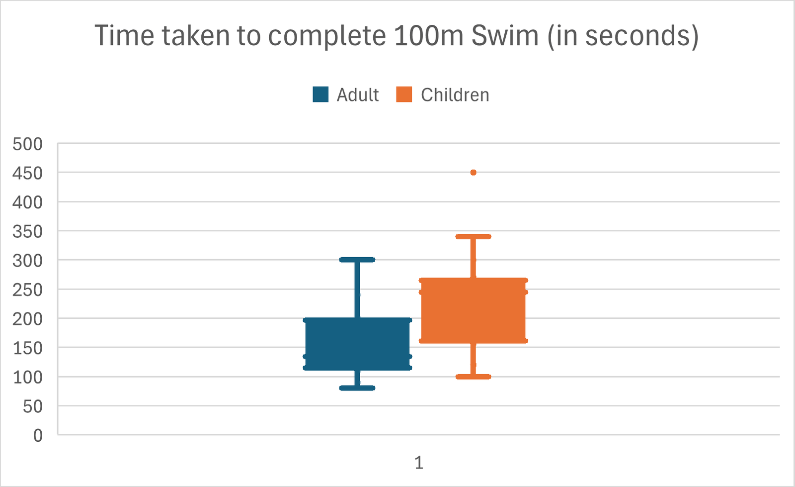
As shown in the Box plots above, the scenario depicts the data collected for 2 groups for population (Adult and Children) on the time taken (in seconds) for each individual to complete the 100m swim. The data collected is as shown below:
| Adult | Children |
| 193 | 250 |
| 170 | 260 |
| 185 | 245 |
| 200 | 300 |
| 201 | 259 |
| 130 | 180 |
| 120 | 340 |
| 123 | 120 |
| 134 | 100 |
| 100 | 167 |
| 121 | 189 |
| 90 | 156 |
| 240 | 450 |
| 300 | 270 |
| 80 | 257 |
| 145 | 221 |
| 110 | 130 |
A box plot begins with the upper and lower whiskers indicating the range of most the data within a set. The upper and lower hinge (the top and bottom) of the box represents the 75th percentile and 25th percentile of the data respectively. The line within the box represents the 50th percentile.
Finally, since all plot points must be represented on a box plot graph, outliers are indicated with dots.
When Box Plots is used
Box plots are useful in comparing how various attributes that would impact a process. In the example above, it demonstrates that the age attribute influences the time taken for the participants to complete a 100m swim.
Six Sigma team may use this tool to compare different attributes of the inputs like time of the day, operators etc. to compare the difference they make to a particular process. It is important to note that only one attribute should be altered at a time else the result won’t tell the real cause of the difference.
How to create the Box Plots
The Box plots above can be created in Microsoft Excel with the following steps:
- Input the Adult and Children data sets as 2 separate columns in the excel spreadsheet.
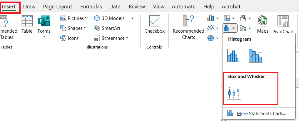
- In the “Insert” tab of the Excel, select the “Box and Whisker” option
- The Box Plot as shown above will be displayed